Fill Your Brush with Elegance
 Come on in and browse the bookshelf for painting resources. Right now you will find some good information about color schemes on the Color Tools Shelf. We will be adding more information relating to color theory, and also a listing of some of reference books that I enjoy. Be sure to check out the helpful videos on the IPad/Tablet/Software Tutorials page.
Color Tools Shelf
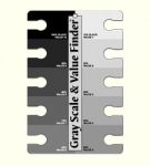
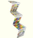
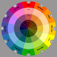 An artist’s pigment color wheel arranges color in hues with red, yellow, and blue, known as the primary colors, at equally spaced points on the wheel. The secondary colors are orange, green, and violet and are colors that can be mixed using two of the primary colors. The six intermediates formed by mixing a primary color with a secondary color, are known as the tertiary colors. These are red-orange, yellow-orange, yellow-green, blue-green, blue-violet, and red-violet.
These color tools are essential for a student desiring to learn more about managing color and then applying these concepts to their artwork.
Color Schemes Shelf
Color schemes are combinations of colors on the color wheel:
Monochromatic
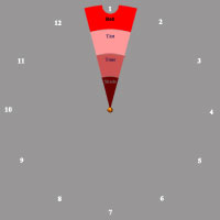 – variations in lightness and saturation of a single color.
Pros: The monochromatic scheme is easy to manage, always looks balanced and is visually appealing.
Cons: This scheme lacks color contrast and is not as vibrant as the complementary scheme.
Tips:
1. Use tints, shades, and tones of the key color to enhance the scheme.
2. Try the analogous scheme; it offers more nuances while retaining the simplicity and elegance of the monochromatic scheme.
Analogous
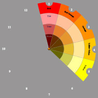 – colors that are adjacent to each other on the color wheel. One color is used as a dominant color while others are used to enhance the scheme.
Pros: The analogous color scheme is as easy to create and looks richer than the monochromatic scheme.
Cons: The analogous color scheme lacks color contrast and is not as vibrant as the complementary scheme.
Tips:
1. Using too many hues in the analogous scheme may ruin the harmony.
2. Avoid combining warm and cool colors in this scheme.
Complementary
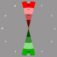 – two colors that are opposite each other on the color wheel.Pros: The complementary color scheme offers stronger contrast than any other color scheme, and draws maximum attention.
Cons: This scheme is harder to balance than monochromatic and analogous schemes, especially when desaturated warm colors are used.
Tips:
1. For best results, place cool colors against warm ones, for example, yellow versus violet.
2. If you use a warm color (red or yellow) as an accent, you can desaturate the opposite cool colors to put more emphasis on the warm colors.
3. Avoid using desaturated warm colors (e.g. browns or dull yellows).
4. Try the split complementary scheme; it is similar to the complementary scheme but offers more variety.
Split Complementary
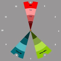 – uses a color and the two colors adjacent to its complementary.Pros: The split complementary scheme offers many nuances while retaining strong visual contrast.
Cons: The split complementary scheme is harder to balance than monochromatic and analogous color schemes.
Tips:
1. Use a single warm color against a range of cool colors to put an emphasis on the warm color (red versus blues and blue-greens, or orange versus blues and blue-violets).
2. Avoid using desaturated warm colors such as browns or dull yellows because this may ruin the scheme.
Triadic
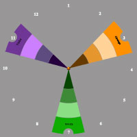 – three colors equally spaced around the color wheel.Pros: The triadic color scheme offers high contrast while retaining harmony.
Cons: The triadic color scheme is not as contrasting as the complementary scheme.
Tips:
1. Choose one color to be used in larger amounts than others.
2. If the colors look gaudy, try to subdue them.
Double Complementary
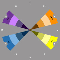 – four colors arranged into two complementary color pairs.Pros: The double complementary (tetradic) scheme offers more color variety than any other scheme.
Cons: This scheme is the hardest scheme to balance.
Tips:
1. Choose a color to be dominant.
2. If the scheme looks unbalanced, try to subdue one or more colors.
3. Avoid using pure colors in equal amounts.

Jeanne Downing Decorative Art Designs
468 43rd St., Loveland, CO 80538-1777

Fill Your Brush with Elegance
 Come on in and browse the bookshelf for painting resources. Right now you will find some good information about color schemes on the Color Tools Shelf. We will be adding more information relating to color theory, and also a listing of some of reference books that I enjoy. Be sure to check out the helpful videos on the IPad/Tablet/Software Tutorials page.
Color Tools Shelf
 An artist’s pigment color wheel arranges color in hues with red, yellow, and blue, known as the primary colors, at equally spaced points on the wheel. The secondary colors are orange, green, and violet and are colors that can be mixed using two of the primary colors. The six intermediates formed by mixing a primary color with a secondary color, are known as the tertiary colors. These are red-orange, yellow-orange, yellow-green, blue-green, blue-violet, and red-violet.
These color tools are essential for a student desiring to learn more about managing color and then applying these concepts to their artwork.
Color Schemes Shelf
Color schemes are combinations of colors on the color wheel:
Monochromatic
 – variations in lightness and saturation of a single color.
Pros: The monochromatic scheme is easy to manage, always looks balanced and is visually appealing.
Cons: This scheme lacks color contrast and is not as vibrant as the complementary scheme.
Tips:
1. Use tints, shades, and tones of the key color to enhance the scheme.
2. Try the analogous scheme; it offers more nuances while retaining the simplicity and elegance of the monochromatic scheme.
Analogous
 – colors that are adjacent to each other on the color wheel. One color is used as a dominant color while others are used to enhance the scheme.
Pros: The analogous color scheme is as easy to create and looks richer than the monochromatic scheme.
Cons: The analogous color scheme lacks color contrast and is not as vibrant as the complementary scheme.
Tips:
1. Using too many hues in the analogous scheme may ruin the harmony.
2. Avoid combining warm and cool colors in this scheme.
Complementary
 – two colors that are opposite each other on the color wheel.Pros: The complementary color scheme offers stronger contrast than any other color scheme, and draws maximum attention.
Cons: This scheme is harder to balance than monochromatic and analogous schemes, especially when desaturated warm colors are used.
Tips:
1. For best results, place cool colors against warm ones, for example, yellow versus violet.
2. If you use a warm color (red or yellow) as an accent, you can desaturate the opposite cool colors to put more emphasis on the warm colors.
3. Avoid using desaturated warm colors (e.g. browns or dull yellows).
4. Try the split complementary scheme; it is similar to the complementary scheme but offers more variety.
Split Complementary
 – uses a color and the two colors adjacent to its complementary.Pros: The split complementary scheme offers many nuances while retaining strong visual contrast.
Cons: The split complementary scheme is harder to balance than monochromatic and analogous color schemes.
Tips:
1. Use a single warm color against a range of cool colors to put an emphasis on the warm color (red versus blues and blue-greens, or orange versus blues and blue-violets).
2. Avoid using desaturated warm colors such as browns or dull yellows because this may ruin the scheme.
Triadic
 – three colors equally spaced around the color wheel.Pros: The triadic color scheme offers high contrast while retaining harmony.
Cons: The triadic color scheme is not as contrasting as the complementary scheme.
Tips:
1. Choose one color to be used in larger amounts than others.
2. If the colors look gaudy, try to subdue them.
Double Complementary
 – four colors arranged into two complementary color pairs.Pros: The double complementary (tetradic) scheme offers more color variety than any other scheme.
Cons: This scheme is the hardest scheme to balance.
Tips:
1. Choose a color to be dominant.
2. If the scheme looks unbalanced, try to subdue one or more colors.
3. Avoid using pure colors in equal amounts.

Jeanne Downing Decorative Art Designs
468 43rd St., Loveland, CO 80538-1777


